
In early January 2019, while comparing white ROC (Rolex Oyster Cosmograph) Paul Newman dials registered in my Rolex Daytona database, I stumbled upon a previously unknown dial variation. The picture below shows a stunning example of such a dial. At first glance, it looks like a mark 1.5, doesn’t it?
 .
.
Until that moment, I was only aware of the three dial variations shown in the comparison below: Mark 1, mark 1.5 and mark 2.
 .
.
Totally excited, I immediately texted my good friend Ron aka @stockmarketmindgames from Singapore, to tease him about the new discovery. Besides celebrated stock market savant, Ron is also a discerning collector of the most amazing Paul Newman Daytonas you can imagine. Just recently, Ron was interviewed by Wei Koh from Revolution Magazine.
Watch the interview: In Conversation: Ron K the Paul Newman Daytona Collector
.
A few days after my announcement, Ron came to Malaysia for work and we had the opportunity to meet in Kuala Lumpur for dinner. I couldn’t wait to show him what I had discovered but to my total surprise, Ron already knew about it.
A collector from Thailand, who goes by the name of @may_pakawat, posted about this on Dec. 11, 2018. Ron showed me the post and it was indeed about the same dial variation I had come across. I am sure, one or two other distinguished Daytona collectors knew about this already. Well, there goes the breaking news…
The comparison below shows all four dial variations at a glance.
 .
.
The dial type in question is pretty rare. Only six pieces were documented in my database. Seven, if we count @may_pakawat’s 6265. Four 6263 in the 2.2 million case number range, two 6263 in the 2.6 million region and one 6265 at 2.8 million.
.
How to call it?
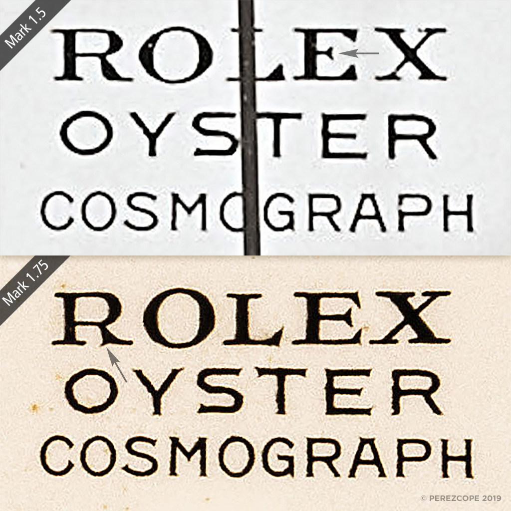
In his post, @may_pakawat referred to this type of dial as mark 1.75. I must admit, I am not perfectly happy with this name but due to lack of better alternatives, I am going to stick with it for the time being.
At first glance, the “new” dial type can easily be confused with mark 1.5, which is probably the reason why it remained undetected by most for so long. The comparison below shows the subtle differences. On mark 1.75, the word “ROLEX” is printed in a different typeface, while “OYSTER” and “COSMOGRAPH” remain basically the same, with some slight variation in thickness due to the printing process.
 .
.
The most notable difference is in the letter “R” of ROLEX. The so-called leg (arrow) with its distinctive downward serif is quite obvious. The letter “E” has a way longer arm. In addition, the “X” has a slightly cursive (italic) appearance.
The next comparison shows that on mark 1.75 (right), the ROC text is printed slightly lower than on Mark 1a and 1b. The very same applies to a variation of the mark 2 dial but more on this later.
 .
.
This comparison makes also clear that the words “OYSTER” and “COSMOGRAPH” share the very same type of font on all three mark 1 dial variations. I say mark 1 variations, as marks 1.5 and 1.75 are basically a transition between mark 1 and mark 2.
I first noticed this type of dial on a 6263 sold by Christie’s Hong Kong in Nov. 2018 but I made the mistake to not look properly and wrongly assumed it was a mark 1.5 dial.
Direct link: LOT 2515 – ROLEX. A VERY RARE AND EXTREMELY ATTRACTIVE STAINLESS STEEL CHRONOGRAPH WRISTWATCH WITH BRACELET AND PAUL NEWMAN PANDA DIAL
.
 .
.
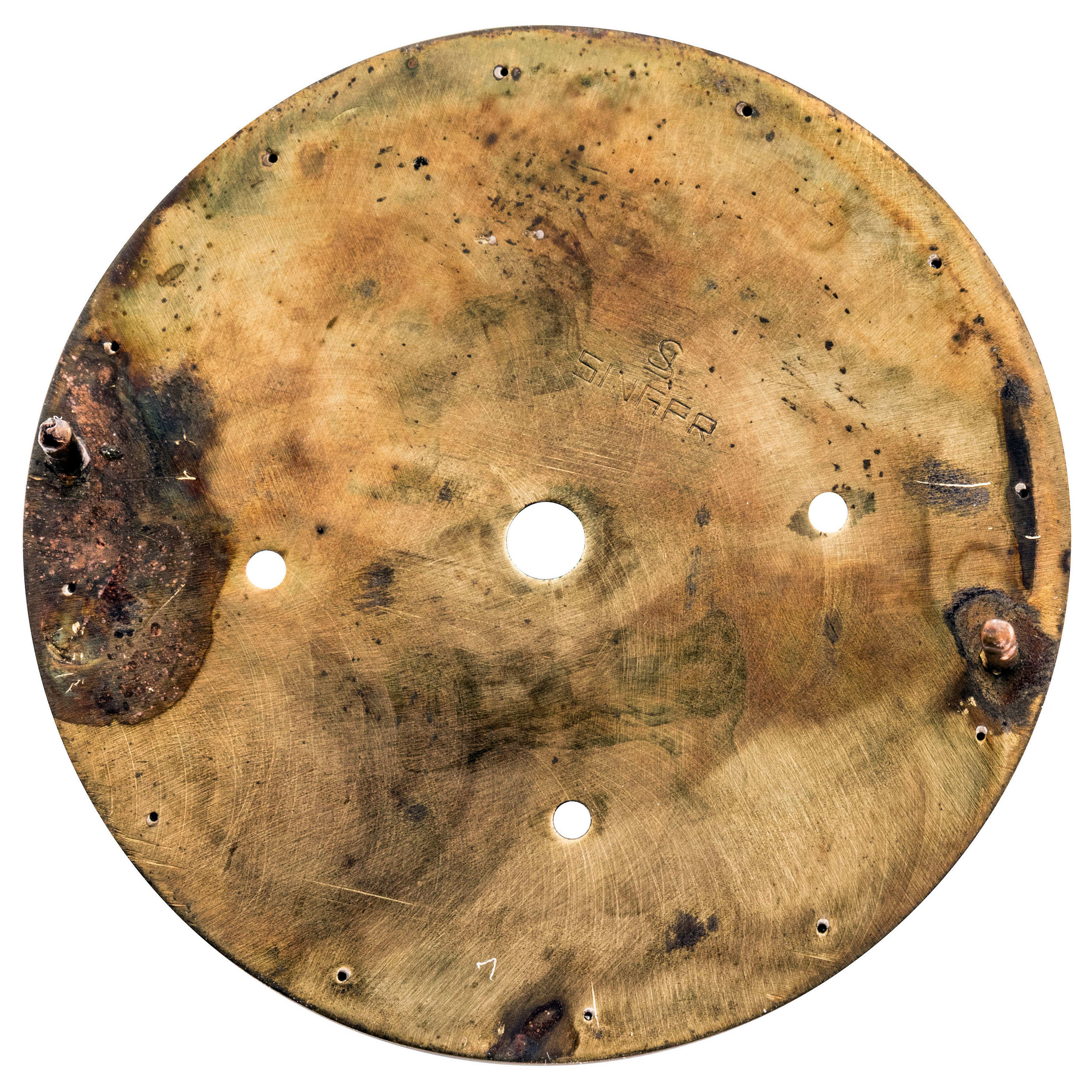
According to Christie’s, this watch came from the original owner. The back of the dial bears a period correct Singer stamp with edgy letters.
 .
.
Mark 2 Variation
As mentioned earlier, I noticed also a variation of the mark 2 dial. The next comparison shows that on some mark 2 dials, the ROC is printed slightly lower, similar to mark 1.75.
 .
.
Dials of this type, with lower ROC text, appear predominantly towards the production end of Paul Newman aka exotic dials.
Please don’t hesitate to leave a comment if you have any questions or remarks. Comments are only displayed after approval.
Thank you for your interest.
Special thanks to Ron and @may_pakawat for their precious contributions.

First off, great work!! I love reading your stuff when I can!! I’m not a big Panerai fan but your story and work on the fake you caught had me glued to reading it like it was the Torah!! Sorry if I am incorrect I am not an expert like you…but…I was reading this article and looking at your comparison photos and I wanted to ask you if I’m mistaken or not in my opinion.
In the section titled, “How to Call It” you say that the Rolex is clearly a different font and the oyster and Cosmograph are the same font with small variations in the ink levels from printing. However, to me when looking at your picture of the 1.5 vs the 1.75 in the same section there appears to be a few differences that to my non-expert eye look like the Oyster is possibly a different font as well. If you compare the top of the S in Oyster it looks like there is a serife on the 1.75 that doesn’t appear on the 1.5. the 1.5 letter S looks to stop very abruptly. It could be printing in levels but to me the 1.5 has such crisp 90 degree edges that it’s hard to imagine they were formed from pure chance.
Could possibly post your opinion or explanation why those are different? Also, to me the O in Oyster on the 1.75 looks shaky to me…while the other letters do look like there was just more ink on the stamps that particular letter looks more like it was hand filled at some point and it doesn’t look like traditional ink bleed or running. Ink bleed usually tapers to points or in kind of runs in the same direction uniformly down hill. Can you explain how the process or dials end up looking different when they’re the same font?
Thank you for your expertise!!
LikeLike